The Godfather of Design: S. Neil Fujita
Who was the puppet master behind one of the most iconic logos of all time? His career might surprise you...
Hi and welcome to the Story Has It community, where we - Yara and Gillian - share the human stories behind movies, songs, art and books. If you love digging into the roots of stories; if you want to know what inspired their creators; and if you enjoy a good dose of nostalgia and old-school glam, then click here to join our backstory gang!
In Vito Corleone’s final scenes in The Godfather - when he counsels his son Michael for the last time - he conjurs imagery of those in power as puppet masters:
“I never wanted this for you. I work my whole life - I don’t apologize - to take care of my family, and I refused to be a fool, dancing on the string held by all those big shots. I don’t apologize - that’s my life - but I thought that, that when it was your time, that you would be the one to hold the strings.”
The marionette strings image has become synonymous with the Godfather ‘brand’, and it’s by the hand of one man: a Japanese American artist who conquered the ad world, revolutionised jazz album design, and even won over Truman Capote…
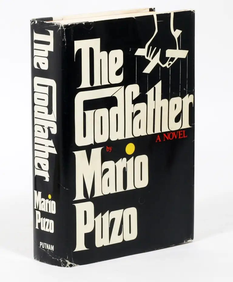
In the late 60s, graphic designer S. ‘Neil’ Fujita (1921-2010) was approached to design a book cover. An experienced artist known for his bold, original designs, he deliberated and experimented, then created a distinct new typeface and a high-contrast hand-drawn logo.
He didn’t know it yet, but he’d just created an iconic piece of work that would form part of his legacy.

The cover design was of course for Mario Puzo’s 1969 novel and it featured an extended G to create a ‘house’ for God and a puppet master’s hand. It became so synonymous with the Godfather story that movie executives jumped on it for the film’s poster, too.
So a huge success, then. And yet, it ranks as only one of MANY career breakthroughs for Fujita.
Let’s go back a bit…
Sadamitsu ‘Neil’ Fujita was born over a hundred years ago in Hawaii to Japanese immigrant parents. He was 20 and studying art when the Japanese attacked Pearl Harbour and he became a victim of Executive Order 9066, which led to the unconstitutional detainment of more than 100,000 men, women and children of Japanese descent in the US.
His wartime experiences reveal a lot about his character. He was incarcerated in an internment camp, and in an attempt towards some normality, he signed on as art director of the camp newspaper. Later, he enlisted for the US military (bear in mind - for a country that had only recently deprived him of his freedom) and served in a regiment of Japanese American volunteers that became the most decorated unit in the war.
After the war, Fujita was able to complete his studies and he got a job with an ad agency, where his avant garde art style really began to flourish. One particularly successful ad caught the attention of Columbia Records and they clearly saw his talent, because they hired him to build a whole new design department with one major challenge: to transform their album artwork.
Fujita didn’t tackle this by halves. Previously, album covers might have had a basic picture or illustration with the name of the artist. Fujita’s creations took a very different approach, using original works of art to truly complement and showcase the music.

At Columbia, Fujita was the first graphic designer to use painters, photographers and illustrators to create album artwork. (He was also one of the first to employ both men and women in a racially integrated office.) After several successful years, he left to start his own firm and began breaking ground with book covers, too.
Four years before he was approached for Mario Puzo’s book, he worked directly with another somewhat famous author (!) …
“I showed Truman Capote my ideas for In Cold Blood. I thought of a red hatpin that I stuck into the title of the book to suggest death or something like that, but he didn't like the color. ‘It can't be red, because it wasn't a new death, it didn't just happen,’ so I changed the color to purple and added a black border to suggest something more funereal. Capote loved that.”
Neil S. Fujita in an interview with art director and journalist, Steven Heller
Fujita is remembered as one of the titans of mid-century graphic design. His creation for The Godfather is still one of the most recognisable book jackets of all time. In fact, the font is so distinctive and identifiable that it’s become known as ‘the Godfather font’!
And - sorry, but we’ve been restrained on the puppet puns - Fujita held all the strings. Story has it that in 1972, he halted a Times Square billboard for the movie mid-installation because they hadn’t yet agreed on his designer credit!
For more, here’s a brief look at Fujita’s groundbreaking work, with some interesting interview footage from his son:
If you’d like to see more design or book backstories, drop a comment below - we’d love to hear from you.


Your piece on S. Neil Fujita was fascinating! I loved learning about his journey, from the internment camps to creating the iconic Godfather logo. The anecdote about Truman Capote's In Cold Blood cover was particularly intriguing. Your storytelling beautifully highlights his incredible contributions to design.
Fascinating